
COVID-19, or the coronavirus, is currently making its way across the globe. And tracking its spread has become a pastime for concerned citizens who want to see its progress across the world. If you’re one of these people, here are the most useful maps to find online.
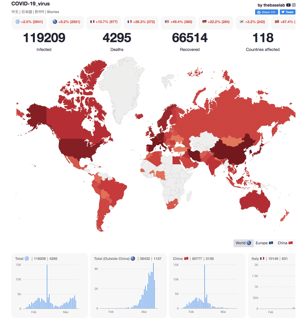
There are a number of apps, dashboards, and maps out there. The ones on this list are created from reputably-sourced data. Maps here cover the whole world, as this is swiftly becoming everyone’s problem. To that end, here are the ones that’ll help you track the virus based on the most up-to-date information.
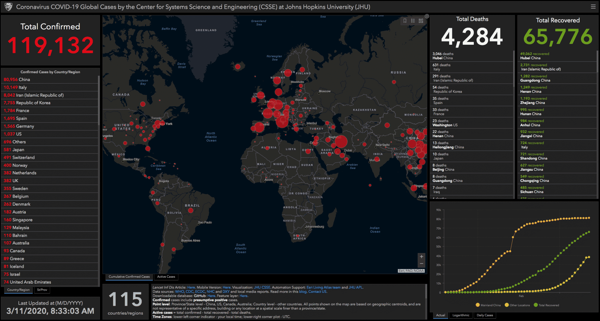
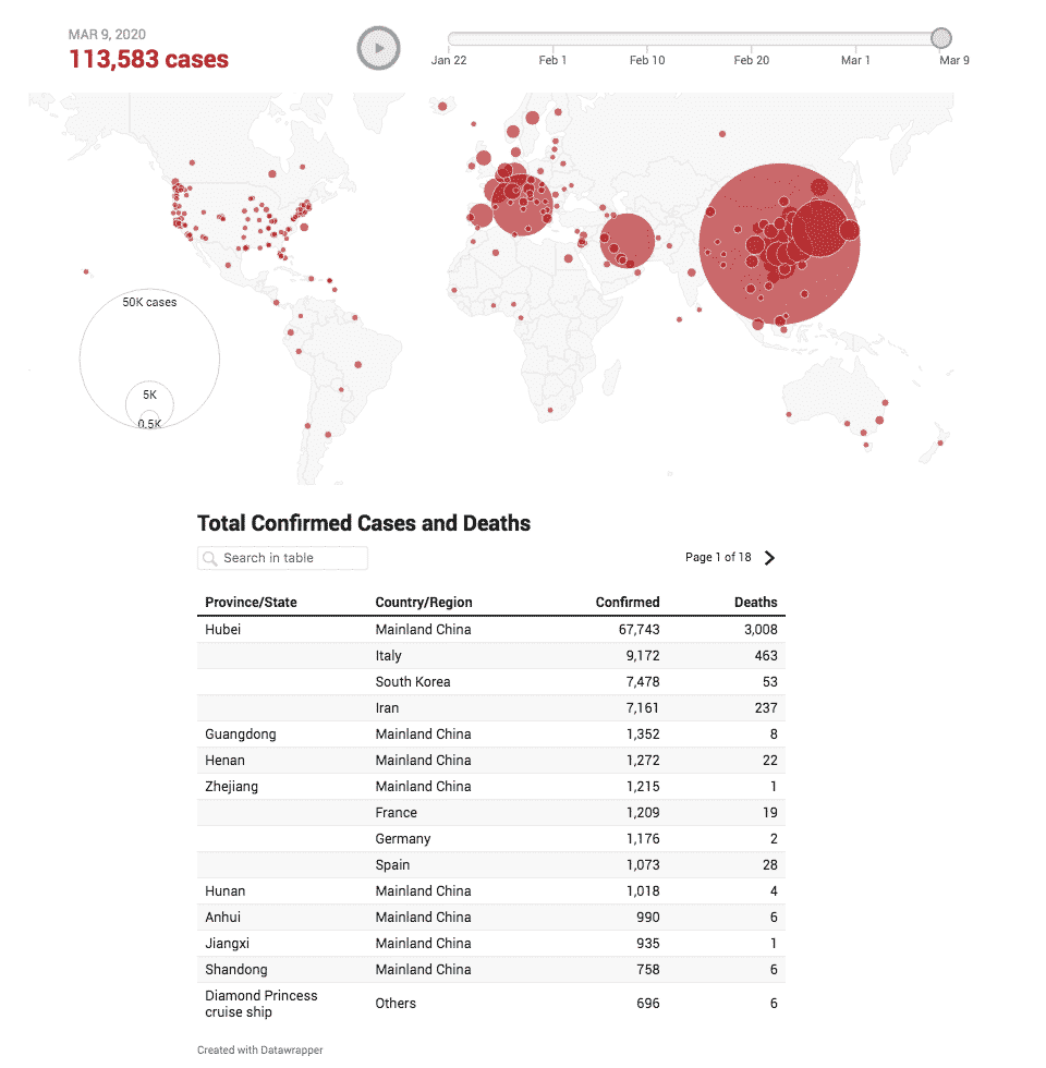
A lot of these maps use data from Johns Hopkins University, which also offers its own map. Out of all the “big circle” maps out there, the Johns Hopkins map seems to be the most precise. There’s also a mobile version for those of you tracking the virus from your phones.
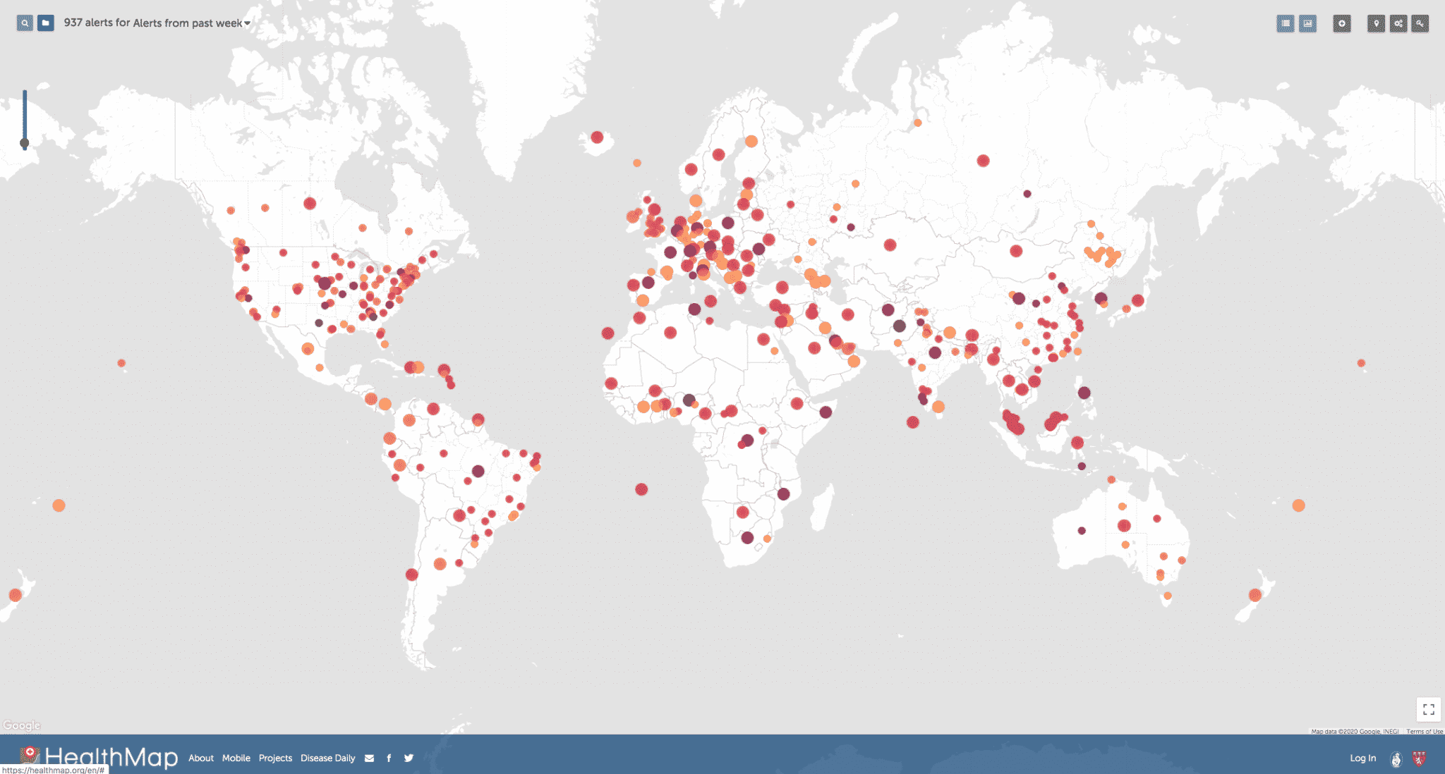
When it comes to animation, however, HealthMap is by far the most attractive — in that it’s visually pleasant (if you’re a dark mode junkie like me and dig the charcoal color scheme) and has the most appealing animation. It pulls data from multiple different sources, and allows you to animate the spread of the virus all the way to some of the first reported cases.
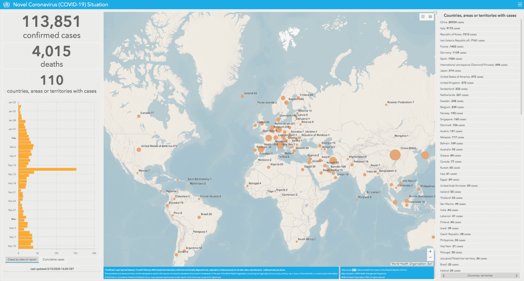
If you’re not big on dark mode, however, the World Health Organization’s dashboard is much more bright and cheerful.
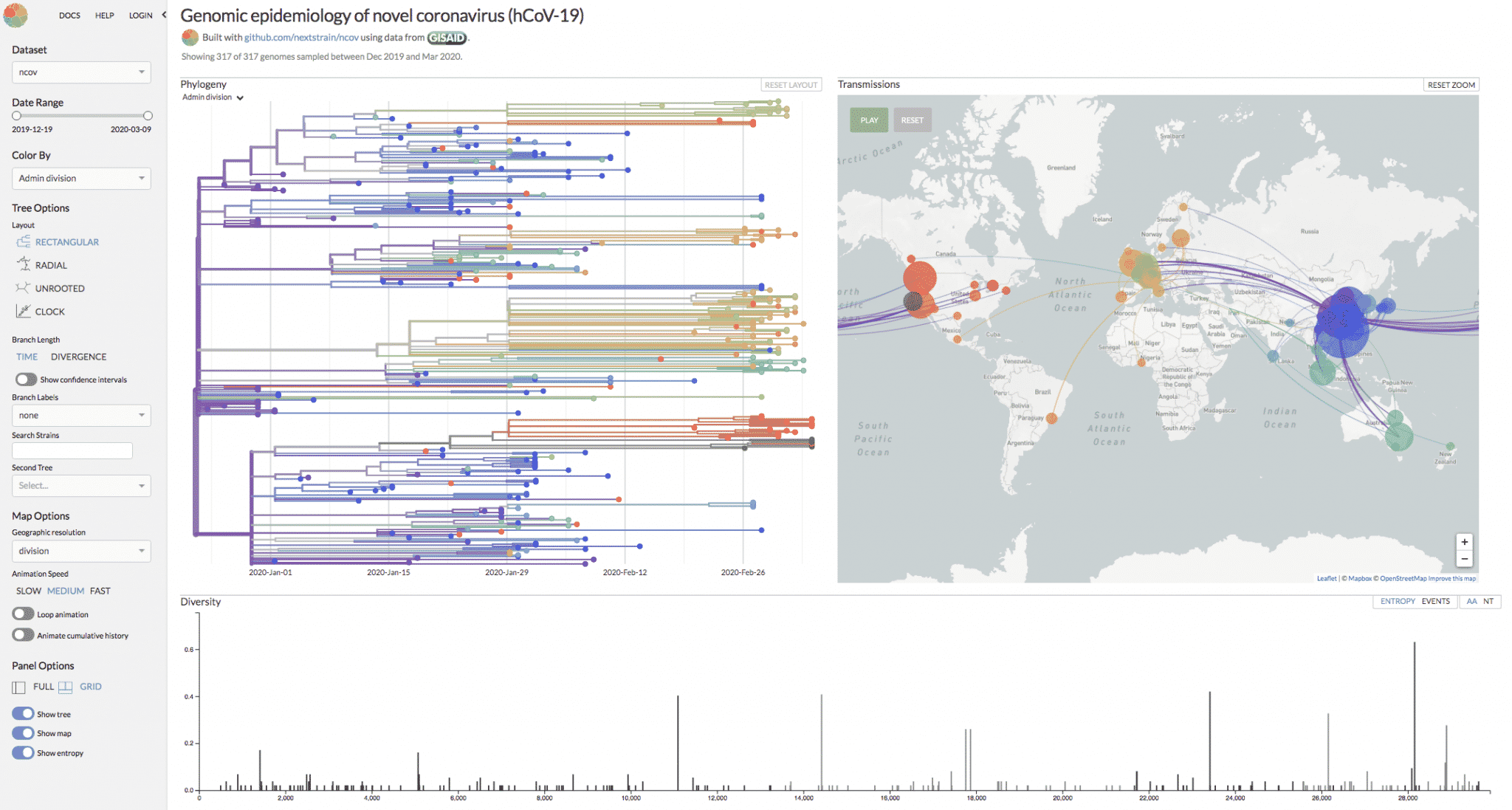
NextStrain is pretty technical, but if you want to see a little more information about how the disease has spread as far as it has, its map is by far the most informative. It breaks down the genome of the virus, alongside an animated map showing the routes by which its traveled from country to country.
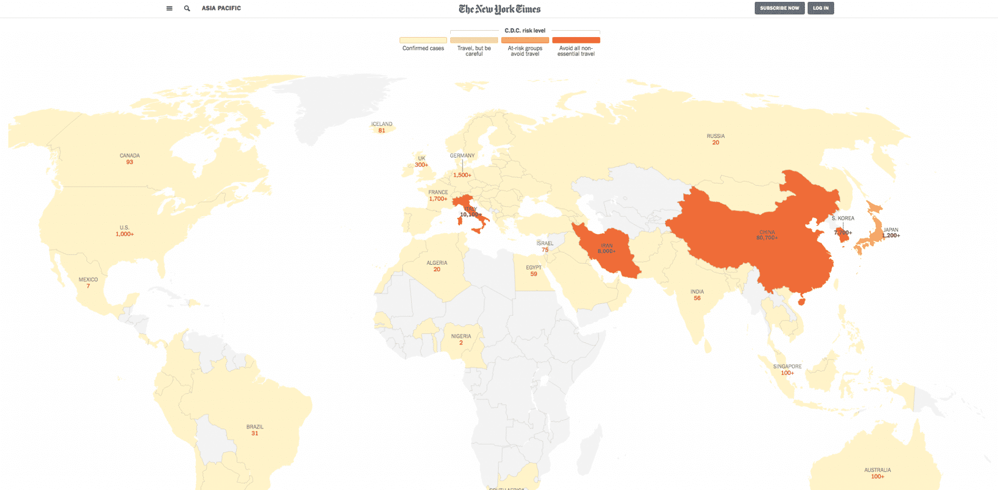
This map from NBC New York shows the spread of the virus over time, and is current as of yesterday. It’s not as impressive as some of the other maps on this list, but it’s also a bit simpler to look at and interact with.
As far as non-map data goes, the New York Times’ dashboard is the most well-rounded and has the easiest-to-read charts. Not everyone is a visual learner, the NYT has a number of text stats describing the situation around the world.
Similarly, TheWuhanVirus shows the spread of the infection in red-and-white country shapes. The site’s owner is not as active as he was, by his own admission, but he said the site is still updated at least four times a day.
Stay informed, wash your hands, and isolate yourselves if need be. If you take your coronavirus information in non-visual form, here’s a list of resources on the disease: